Mirthy are a tech-for-good start-up, on a mission to reduce social isolation for older people through their online events platform.
The Context
Before starting this project Mirthy had taken part in Nesta’s Tech to Connect Challenge where they had launched a bare-bones brand and the first iteration of their platform. Placing as a runner up in that challenge had opened the doors to further funding and they were now able to partner with The Developer Society who helped them level-up their digital presence and build a more robust platform in Wagtail with integrated video conferencing and payment systems.
I worked on The Developer Society's agency team as solo designer alongside a front-end developer, back-end developer, project manager and Mirthy’s CEO and COO.
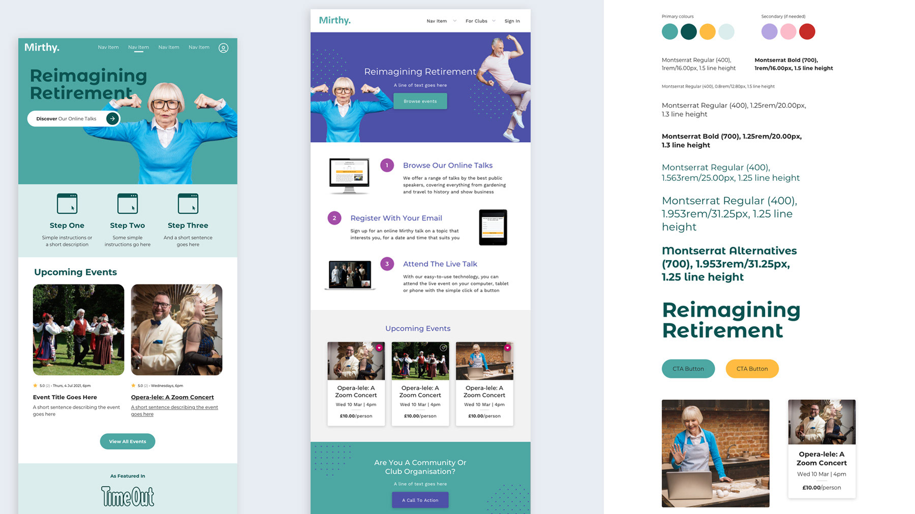
Two creative routes and the beginnings of a UI kit
Design process
I began by pulling together two creative routes using Mirthy’s brand documentation and key reference materials as a starting point. Although they loved both, one was a clear favourite. The chosen route leans into Mirthy’s core colour palette, uses their brand typeface Montserrat for body copy, and introduces its quirky partner Montserrat Alternatives in headlines.
With the route agreed on, I fleshed out the beginnings of a UI kit and used that to style up the three core page templates - the home, catalogue and product pages. After a few tweaks here and there I handed the kit and templates over to the build team and moved on the main payment flow. We launched with a first pass of the flow, and then revisited it to design in additional functionality.
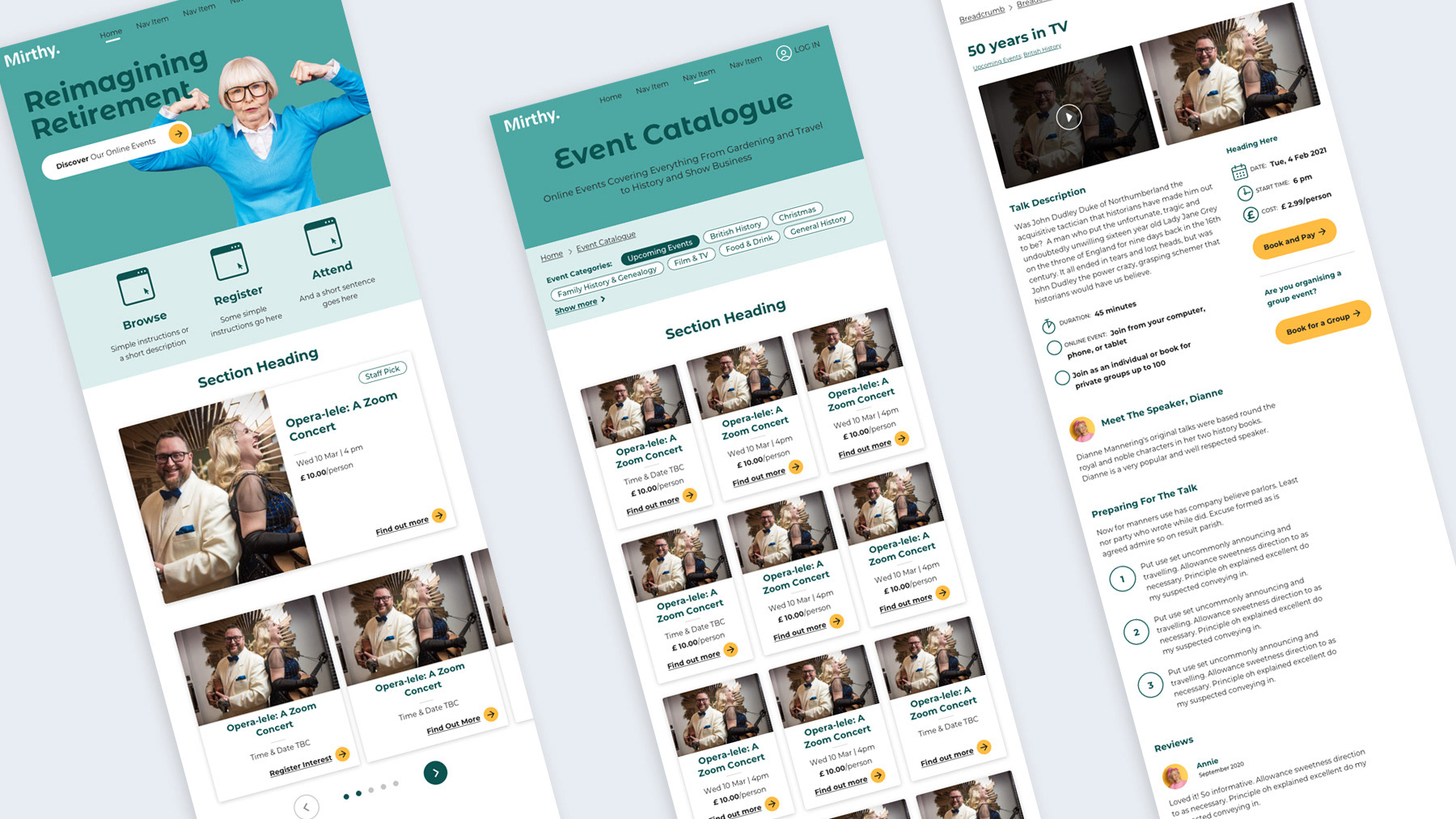
Core page templates - home, catalogue, and product
Challenges/design considerations
As with all of The Developer Society’s projects this project was designed to meet WCAG’s AA standard, but in addition, needed to consider the needs of an older audience group (60-80). We knew that our target audience primarily used tablet devices, followed by laptops as so prioritised these screen sizes. I also used research from the agency’s work for AgeUK to inform some of the key design decisions. The report found that older users are often not as familiar with design patterns that have become common for a younger audience, such as cards and icons. With this in mind, I paired icons with supporting text, and included clear calls to action to indicate interactivity. I designed buttons to be large with high contrast between text and background, for those users with ageing eyesight, who may also have limited movement in their hands.